How to Make Retail Packaging Magnet for Attracting Buyers?
July 24, 2024
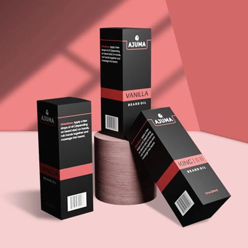
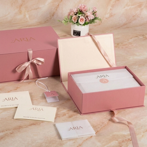
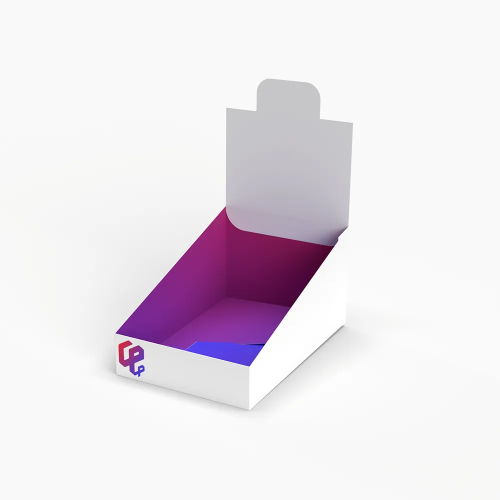
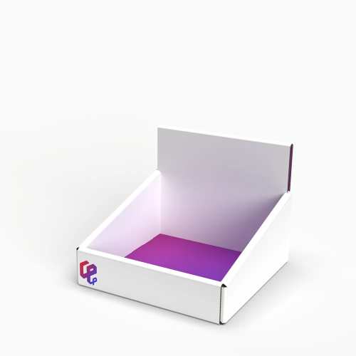
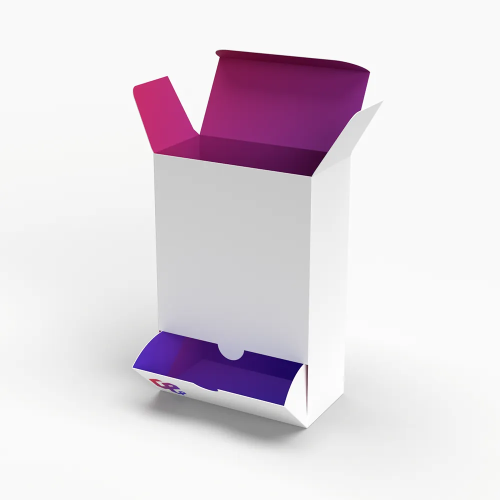
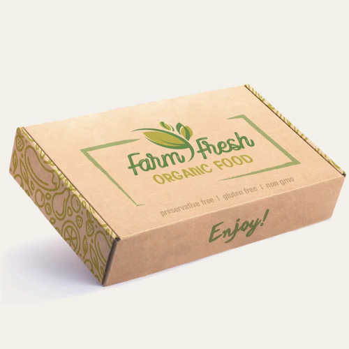
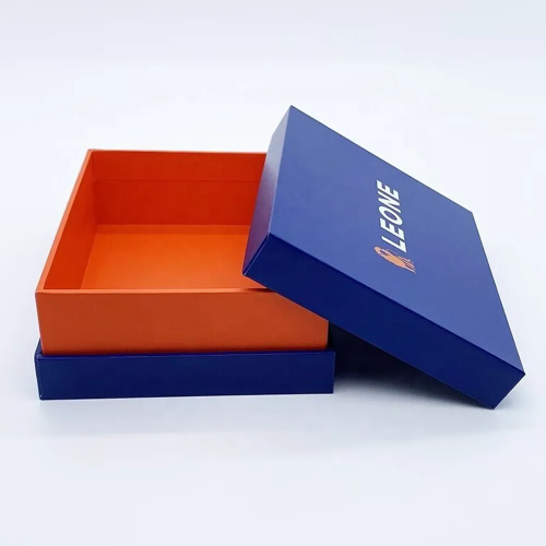
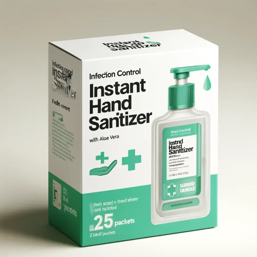
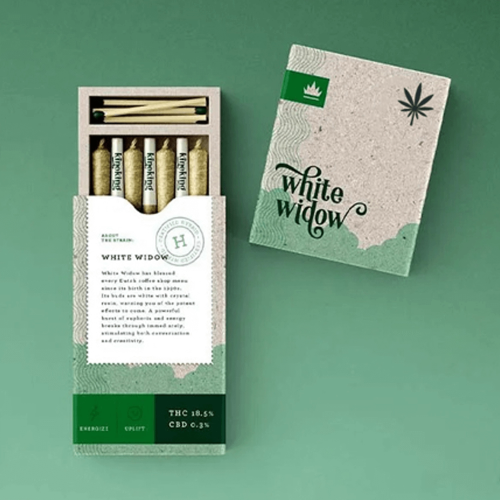
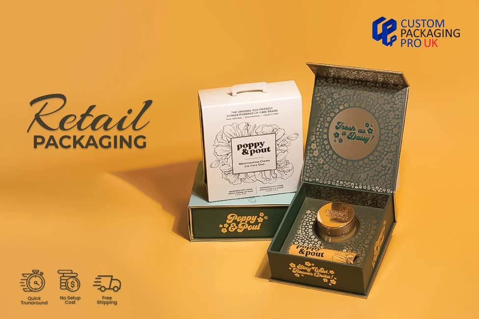
Who would not want to attract potential customers and generate revenue? Any vendor that enters the market will want to do so, but with proper planning. The main tool for this purpose is none other than the Retail Packaging itself. It is the very first interaction of your item with the customer. From “eye contact” to the moment your buyer grabs the package and puts it in the shopping cart, there are a lot of steps. Some readers might be surprised to read the term eye contact for a printed box, but it is true. Their eyes are the designs full of vibrant colours. The typography will invite the end user to come towards the rack and pick the item. There is a complete psychology behind all this. To understand how to develop a solution that will positively interact with the consumer, you must read today’s write-up.
The Science behind Custom Printed Retail Packaging Boxes
If we talk in real, there is no rocket science behind great Custom Printed Retail Packaging Boxes. Some simple rules that would make it eye-catching and attractive. From stock selection to printing and designing all steps are of crucial importance. Once you make the right choice, it will automatically impact the result. A great material will give you great output with the colours you choose. Second, comes the style and shape of your solution. It must be not only sturdy but also unique, according to the item inside it. A box for perfume must not look like a milk container. An odd appearance will distract your customer. Try some unique patterns and styles, but remain within your domain. In the same way, unusual fonts and typography also play a distinctive role in grabbing attention, especially if you want to propagate your items online, all that will matter.

Perks of Impactful Soap Packaging Style and Design
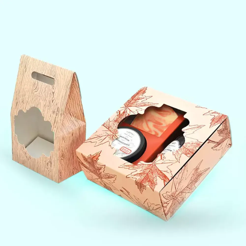
If we apply the above rules to Soap Packaging, you will get extraordinary results. For instance, a unique style and design of your box will attract the target audience. However, it shall be a reflection of the item inside it. A beauty soap will look great in a box with a stunning picture of a girl in a bathrobe. A medicated one will look attractive with before and after pictures of a face with pimples etc. Soaps especially designed for kids will be attractive with cartoon characters. In the same way, labels and tags also play an important role in making your design attractive. There is also a trend of minimalistic layout these days. The minimum use of colours and pictures makes the appearance catchy, but not always. It depends upon the item needs and preferences of your designer on how to use that attribute.
Role of Labels and Tags in the Uplift of Custom Soap Box Packaging
Tags and labels play an important role in the differentiation of products by the same company. A business does not produce a single item of the same category. That stands more than true for custom printed soap packaging boxes. There are more than many varieties and types that are not easy to differentiate without proper labelling. In the same way, typography and font types also matter for brand success and customer impact. If the label is not easily readable the fault is in typography. That is the reason we focus on that aspect of the design more than anything. It will also add to the informative edge of your solutions. In short, all these aspects are like the backbone of a successful package.
FAQs
What makes retail packaging attractive to buyers?
Attractive Retail Packaging uses bold colours, clean design, and clear branding to catch attention fast. Simple and smart looks help products stand out on shelves.
How does good packaging help increase sales?
Good Retail Packaging builds trust and makes the product look premium. When packaging looks appealing, buyers feel confident to purchase.
Can retail packaging really influence buying decisions?
Yes, many customers decide within seconds. Eye-catching Retail Packaging can emotionally connect and push buyers to choose your product.
What design elements should I focus on for retail packaging?
Focus on colours, fonts, logo placement, and packaging material. These elements make Retail Packaging easy to recognise and visually appealing.
Do buyers care about sustainability in retail packaging?
Yes, eco-friendly Retail Packaging is highly valued today. Many buyers prefer recyclable and sustainable packaging options.
Should retail packaging only look good or also protect the product?
Retail Packaging should do both, look attractive and protect the product. Strong packaging keeps items safe and customers happy.
